
Plant-based (Vegan) Cheez Packaging Design
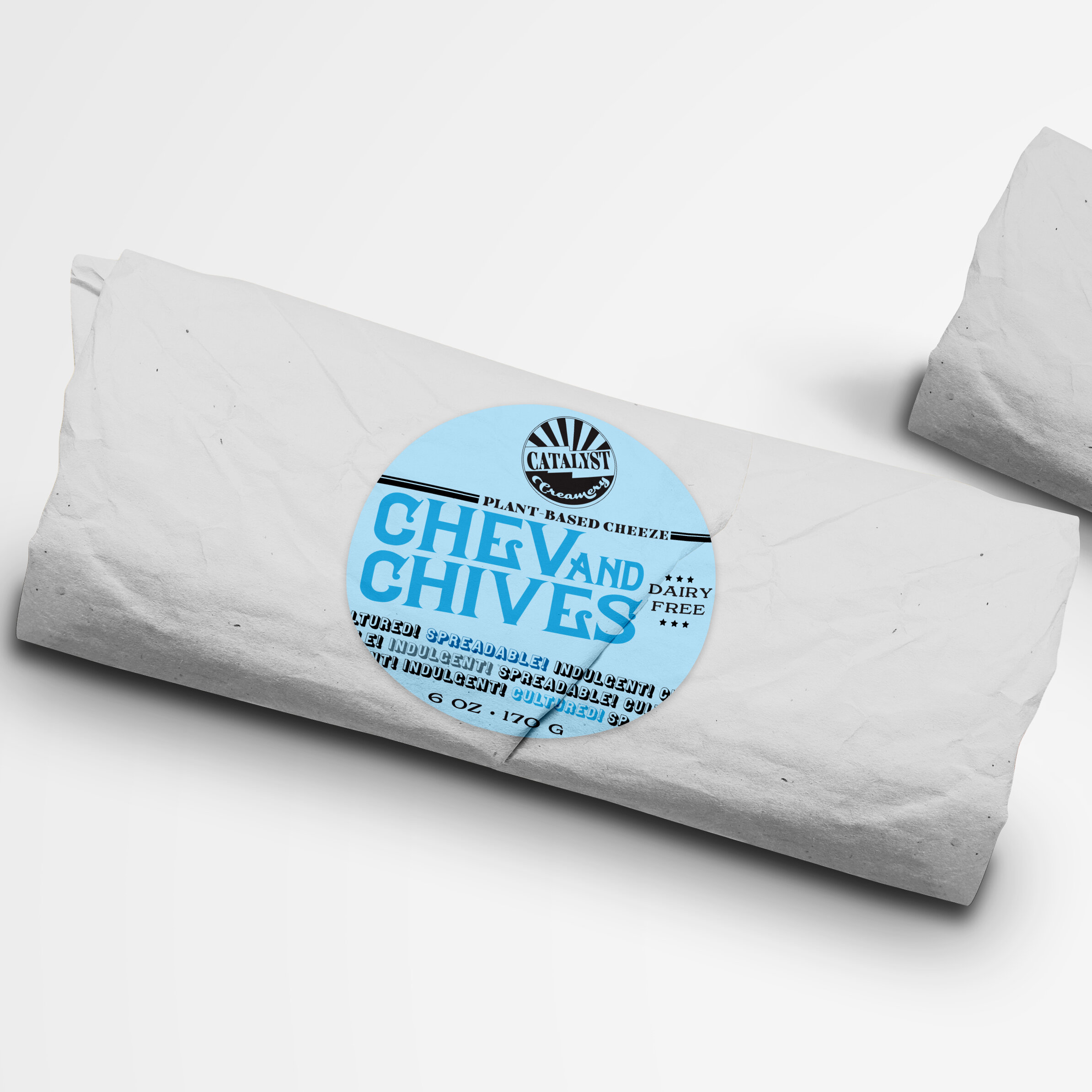
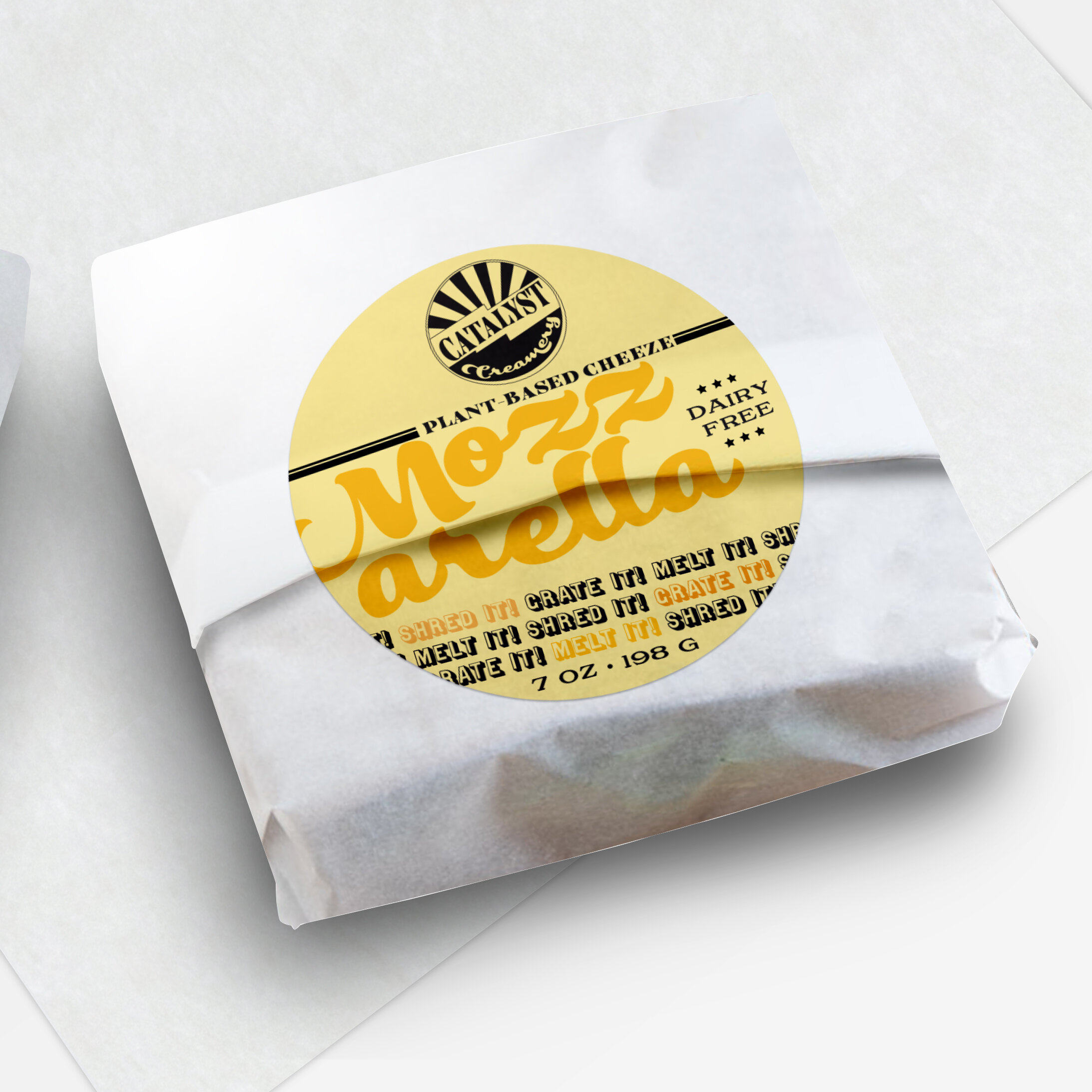
Owner Katie Jones is out to change the world. From hosting a podcast about food sustainability to creating an animal-free product to sourcing biodegradable cheese wraps, she is creating a business where she definitely walks the walk. In building her revolution, she needed a visual identity that was slightly cheeky yet still reminiscent of the traditional dairy in order to feel familiar. Drawing from vintage bottle cap designs, I created a logo that married the two disparate words in her company name “Catalyst Creamery”.

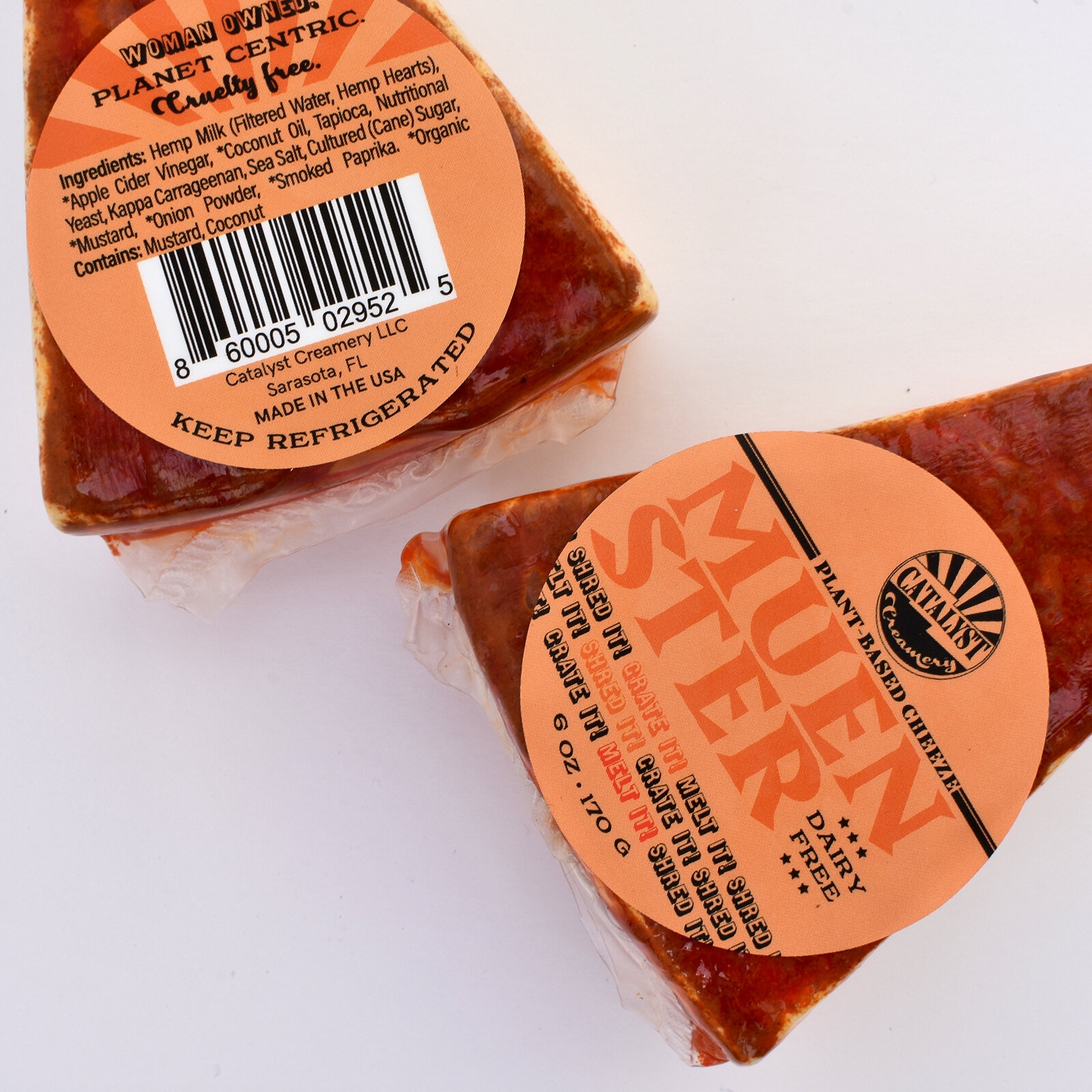
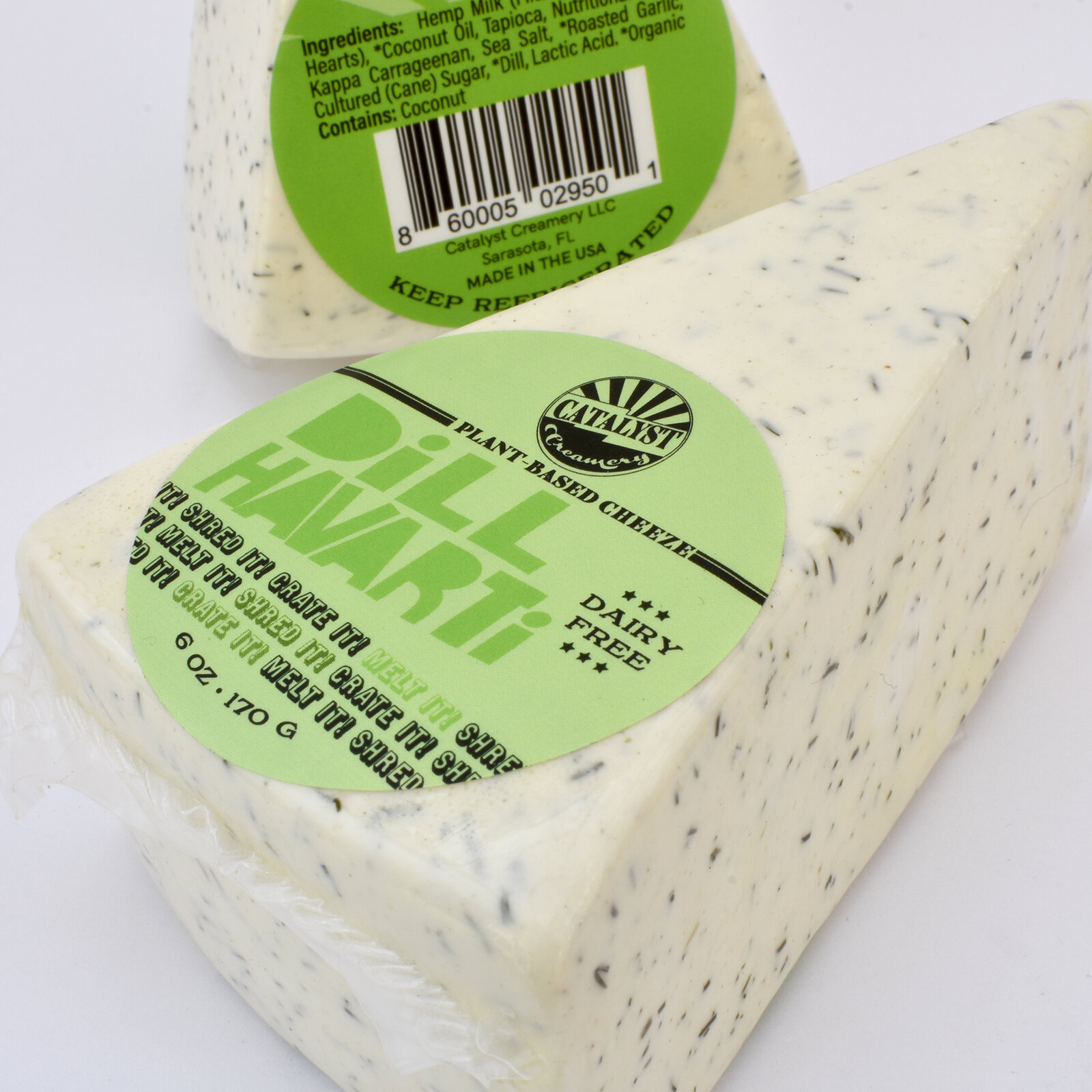
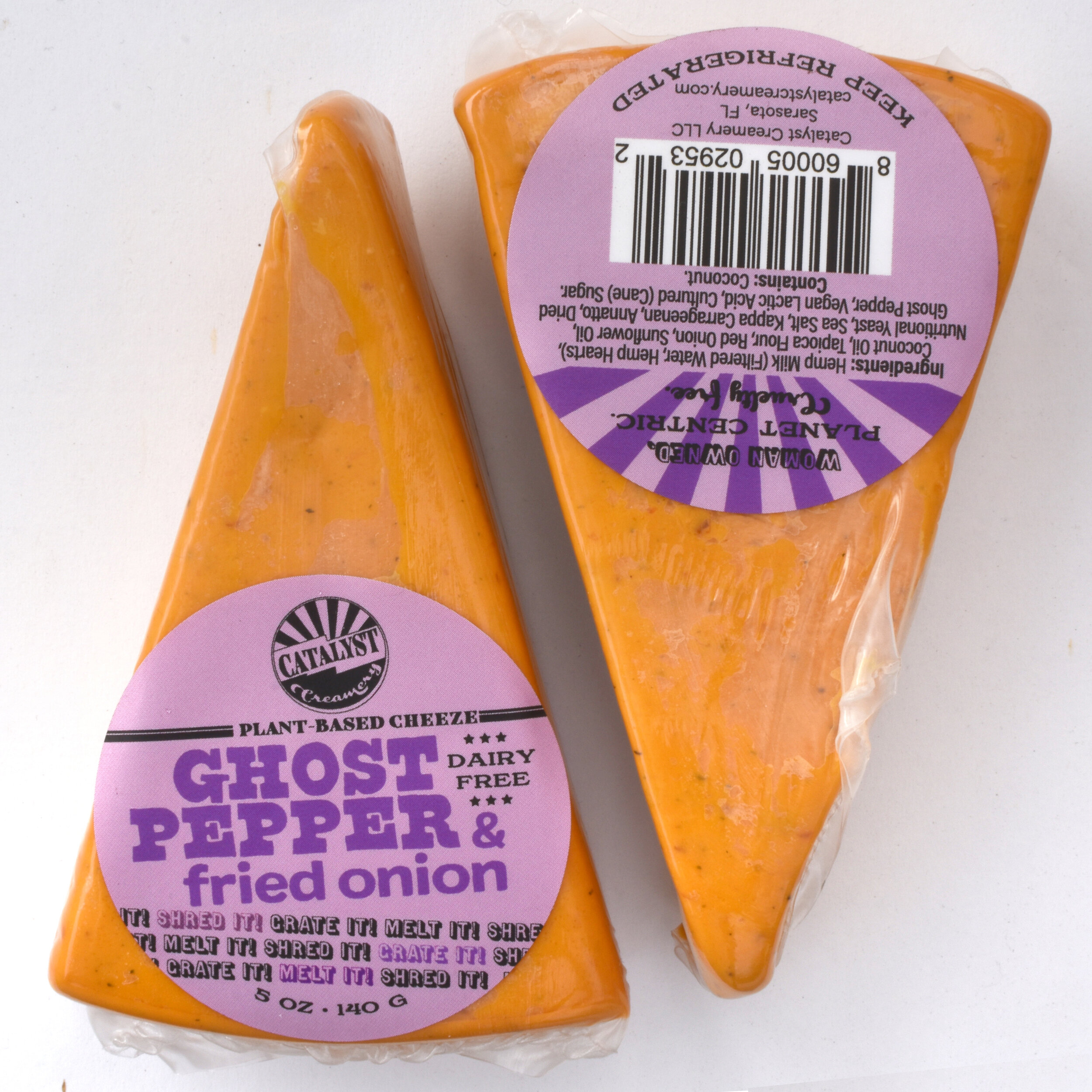
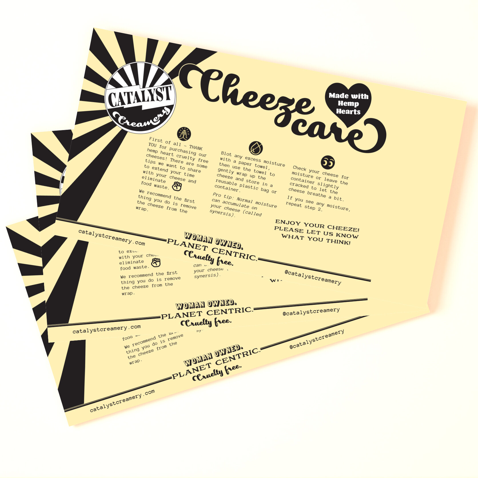
We then took that revolutionary spirit and carried it over to her actual labels; 5 flavours in all. I also created a template for experimental flavours so that name and ingredient list can be filled out by the client. We eventually also added a “How to store/care for your cheeze” informational postcard to include with each product sale.
“Thanks for all your hard work. You are a design wizard!”
CLIENT: CATALYST CREAMERY
More Detail:
Owner Katie Jones is on a mission to make a difference in the world. She's not just talking the talk, but also walking the walk. From hosting a podcast about food sustainability to developing animal-free products and sourcing biodegradable cheese wraps, Katie is truly a force to be reckoned with. As she built her revolution in the food industry, she realized the importance of a visual identity that would reflect her values and catch people's attention. That's when Eye Candy Design stepped in to create a branding and packaging design that would make a lasting impression.
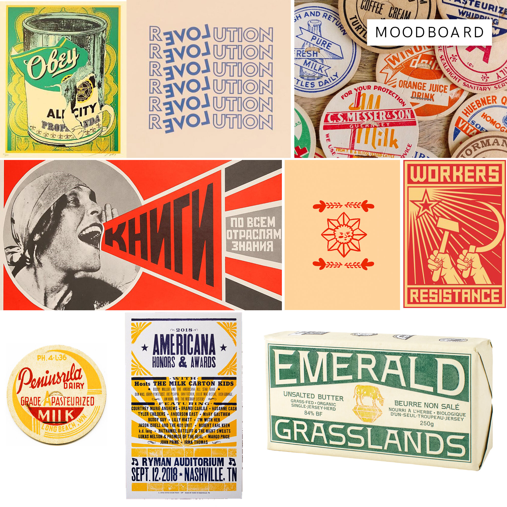
To capture the essence of Katie's vision, we wanted to create a visual identity that was not only slightly cheeky but also evoked a sense of nostalgia for the traditional dairy experience. We brainstormed and drew inspiration from vintage bottle cap designs, which had a timeless charm and a touch of playfulness. It was the perfect foundation to marry the two seemingly contrasting words in her company name, "Catalyst Creamery."
The first step was to design a captivating logo that would be the face of Catalyst Creamery. We crafted a logo that combined the elements of a vintage bottle cap with a modern twist. The typography was carefully chosen to reflect the brand's personality, balancing a sense of tradition with a hint of whimsy. The result was a logo that caught the eye and sparked curiosity, inviting customers to explore what Catalyst Creamery had to offer.
But the branding journey didn't stop there. We knew that packaging design played a crucial role in attracting customers and creating a memorable brand experience. Keeping in mind Katie's commitment to sustainability, we explored eco-friendly packaging options that aligned with her values.
The packaging design itself was a delightful fusion of the old and the new. Drawing inspiration from vintage dairy advertisements, we created a design that exuded nostalgia while still feeling fresh and contemporary. Playful illustrations and cheeky slogans adorned the packaging, adding a touch of personality and capturing the essence of Catalyst Creamery's mission to revolutionize the dairy industry.
Throughout the process, Katie's passion and dedication were infectious, and it fueled our creative journey. The result was a visual identity and packaging design that perfectly represented her brand. The Catalyst Creamery branding and packaging now stood out on shelves, capturing the attention of consumers who were looking for both innovation and a sense of familiarity in their dairy choices.
Katie Jones and her Catalyst Creamery are proof that bold ideas, coupled with a strong visual identity, can truly make an impact. By working closely with Eye Candy Design, Katie was able to create a brand that embodied her values, attracted attention, and ultimately, changed the way people think about dairy products.