
Standing out in the Refrigerator
When owners (and sisters!) Polly and Sarah Senior of Good Pud approached us for their packaging and branding of their new product, I was intrigued. Their mission is to bring to Canada something that Europeans have known for a long while - that you can get delicious, premium desserts in the refrigerator of your local grocery store. We are talking miles beyond a Jello or Snack Pack here!
PROBLEM:
These tiny “pots de creme” are an absolute dream, and needed the premium look to go with it. But we also wanted to strike a good balance between a premium look but also not to take ourselves too seriously.
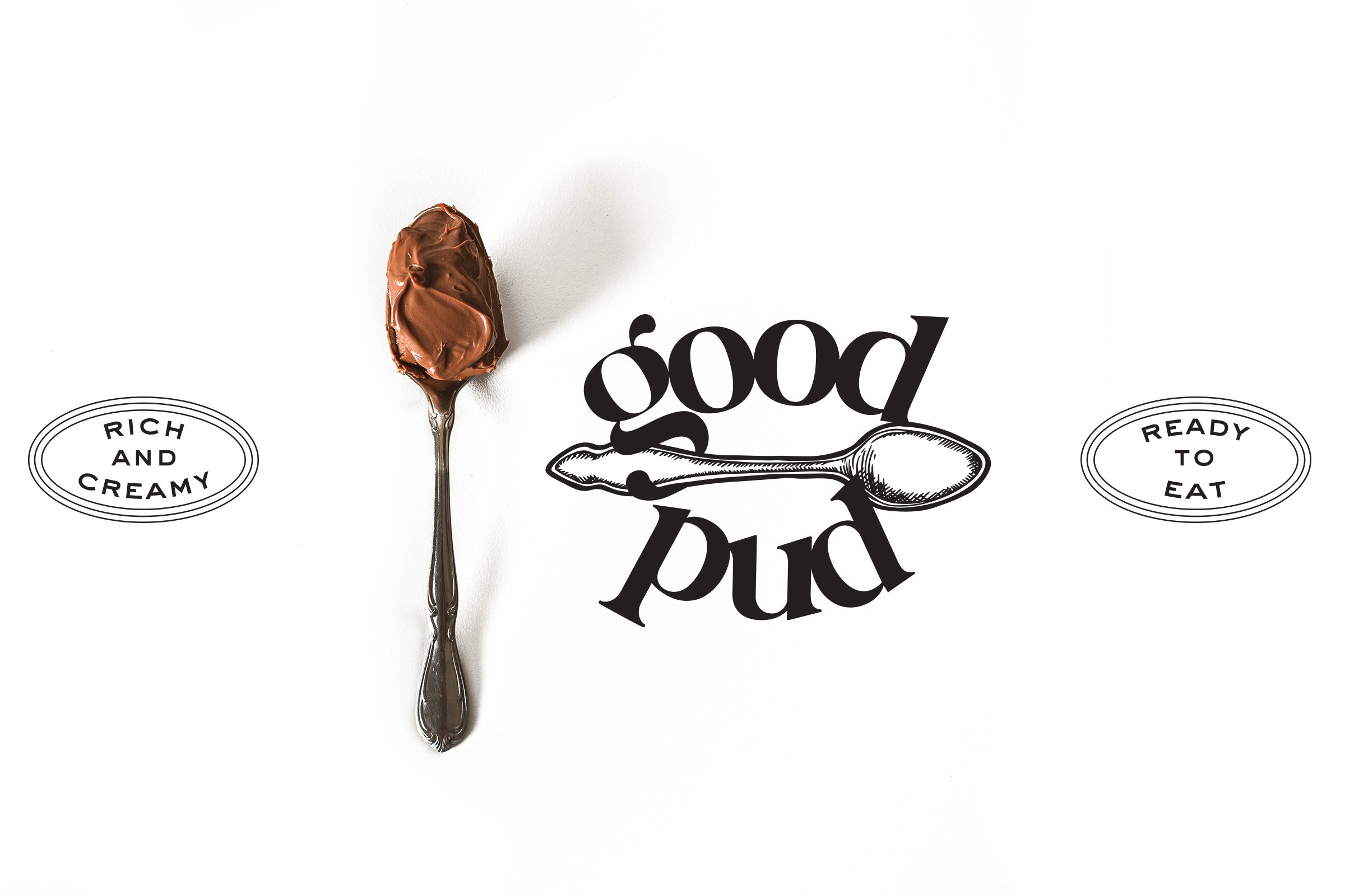
SOLUTION: Knowing that the products would eventually go beyond chocolate (but would always be some sort of pudding style), a spoon was the choice for a graphic mark, along with an elegant but still chunky typeface.
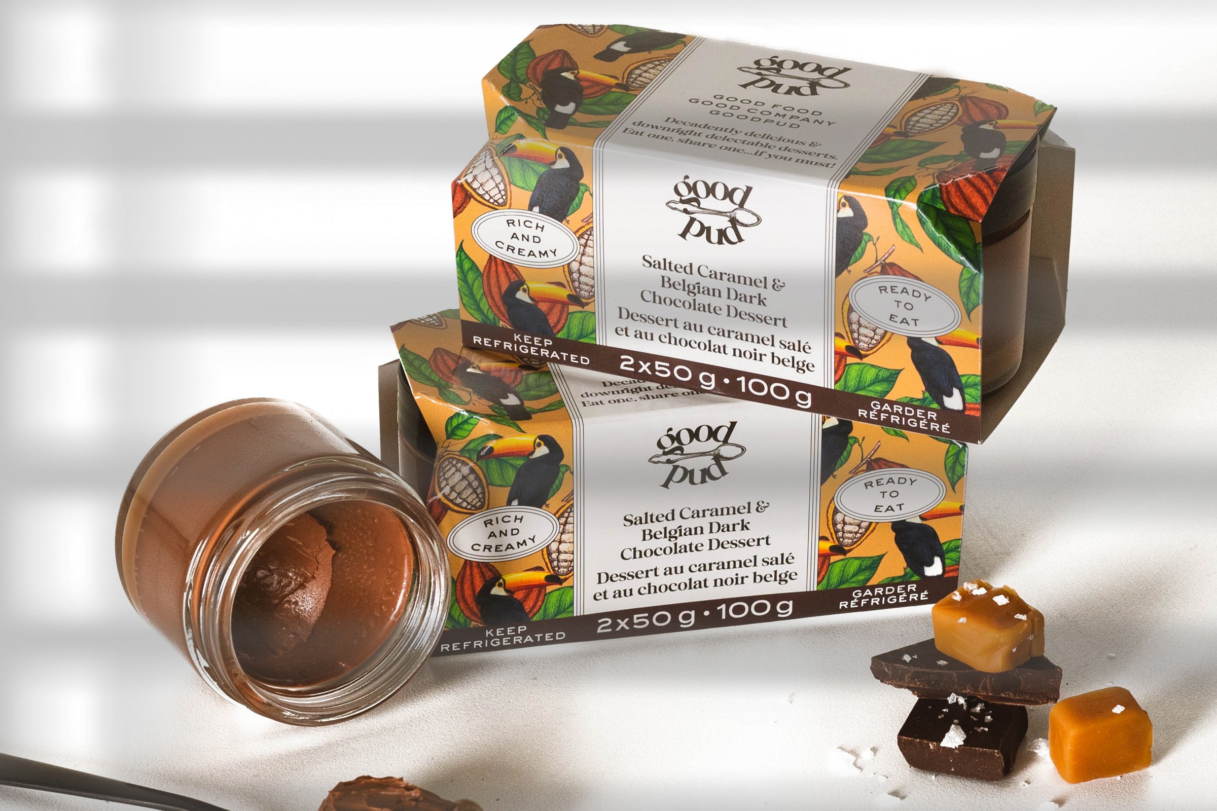
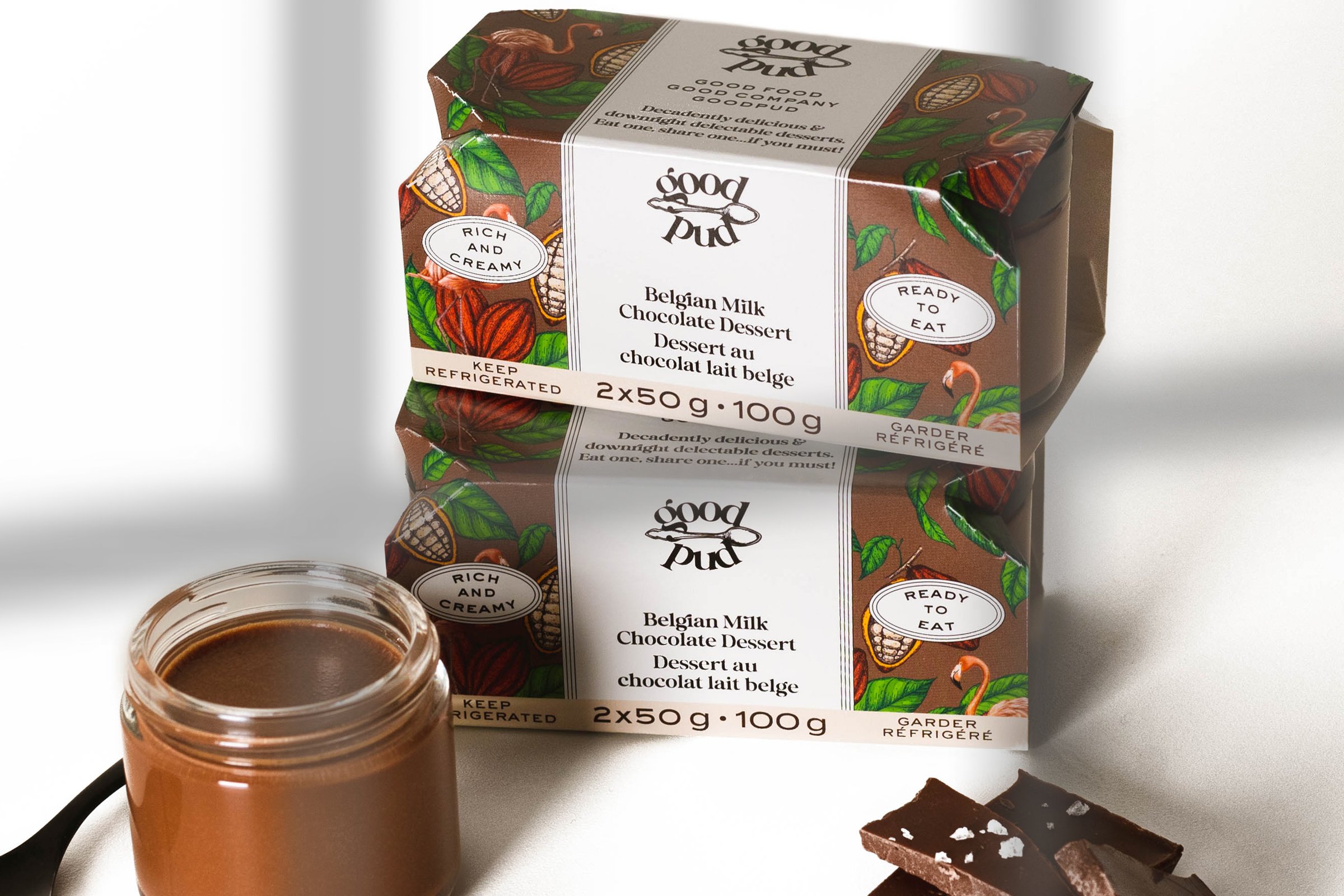
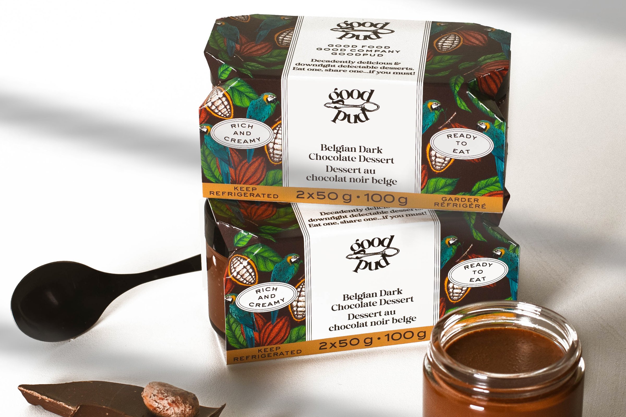
For packaging, we wanted to illustrate the chocolate within, but also the fact that this is dessert and shouldn’t be taken too seriously. Illustrated birds help keep it quirky, which aligns well with the owner’s distinct personalities.
CLIENT: GOOD PUD
More Detail:
When Polly and Sarah Senior, the owners and sisters behind Good Pud, approached us for their packaging and branding needs, we were immediately intrigued. Their mission was clear: to introduce Canadians to the delightful world of premium European-style desserts that could be found right in the refrigerator aisle of their local grocery store.
The problem at hand was creating a packaging design that truly captured the essence of these delectable "pots de creme" while striking the right balance between premium and approachable. We wanted the packaging to reflect the exceptional quality of the desserts without taking ourselves too seriously.
Our solution started with a thoughtful choice for the graphic mark. We knew that the product line would expand beyond chocolate, but always maintaining a pudding-style base. That's why we decided to incorporate a spoon as the graphic mark. The spoon symbolized the indulgence and enjoyment of eating dessert, while also hinting at the smooth and creamy texture of the pots de creme. To complement the graphic mark, we selected an elegant yet slightly chunky typeface. This choice conveyed a sense of sophistication while still maintaining a down-to-earth feel.
For the packaging design, we wanted to create an illustration that showcased the decadent chocolate within the pots de creme. At the same time, we wanted to infuse a playful and whimsical element to remind customers that dessert is meant to be a joyful experience. That's where the idea of illustrated birds came in. These charming birds not only added a touch of quirkiness to the packaging but also aligned perfectly with the distinct personalities of the owners. The birds served as a delightful visual cue, conveying a sense of lightheartedness and fun.
Throughout the branding and packaging design process, our focus was on striking the perfect balance between the premium nature of the product and the approachable personality of the brand. The result was packaging that exuded an air of indulgence while still inviting customers to embrace their sweet tooth and enjoy dessert with a smile.
Polly and Sarah Senior, the masterminds behind Good Pud, now have a branding and packaging design that captures the essence of their delicious and premium desserts. The combination of the spoon graphic mark, the elegant typeface, and the quirky illustrated birds creates a visual identity that is both eye-catching and memorable. Good Pud stands out on the grocery store shelves, enticing customers to explore the world of European-style desserts that are a world apart from traditional puddings.
This case study demonstrates how Eye Candy Design successfully crafted a brand identity that conveys the quality and playfulness of Good Pud's products. By infusing a touch of whimsy into the packaging design, we were able to reflect the distinct personalities of the owners while also appealing to customers seeking a delightful dessert experience.