
Underlining the USP
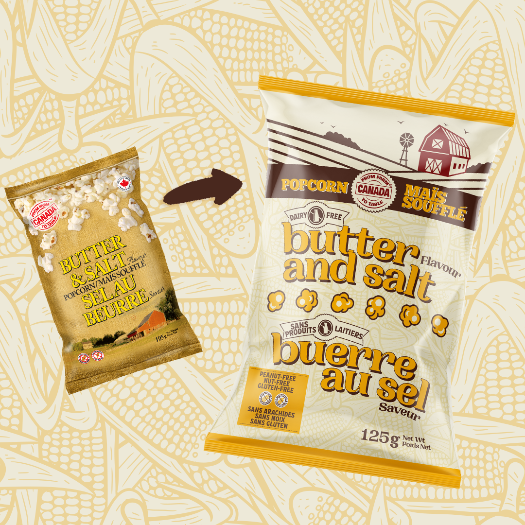
The owner of From Farm to Table Canada knew that the unique value proposition of her product wasn’t clearly spelled out enough on her packaging. In addition, she was paying for costly plates with the amount of colours she was managing on her packaging.
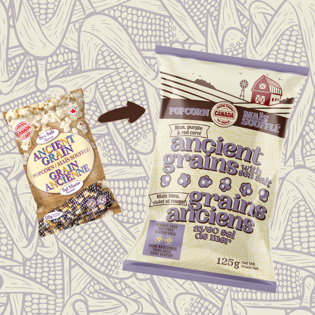
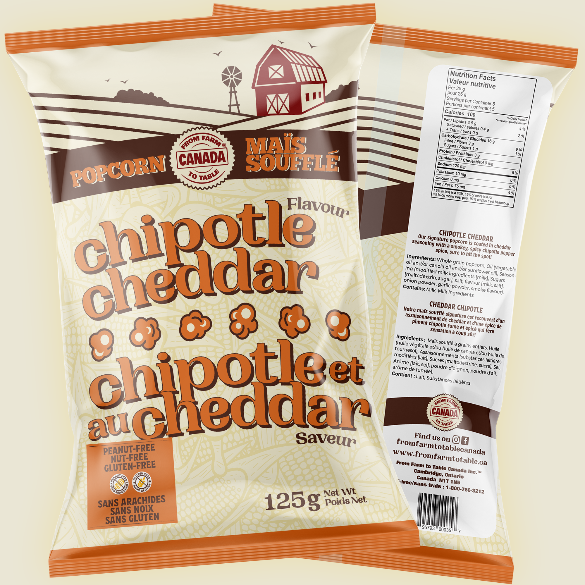
We streamlined the colour palette, converted the photo of the farm into an illustration, and brought it front and centre to the packaging. The typefaces were chosen intentionally to create an authentic Ontario farm feel.
Even from a distance, you can immediate get the feel of this company and their mission to stay local.
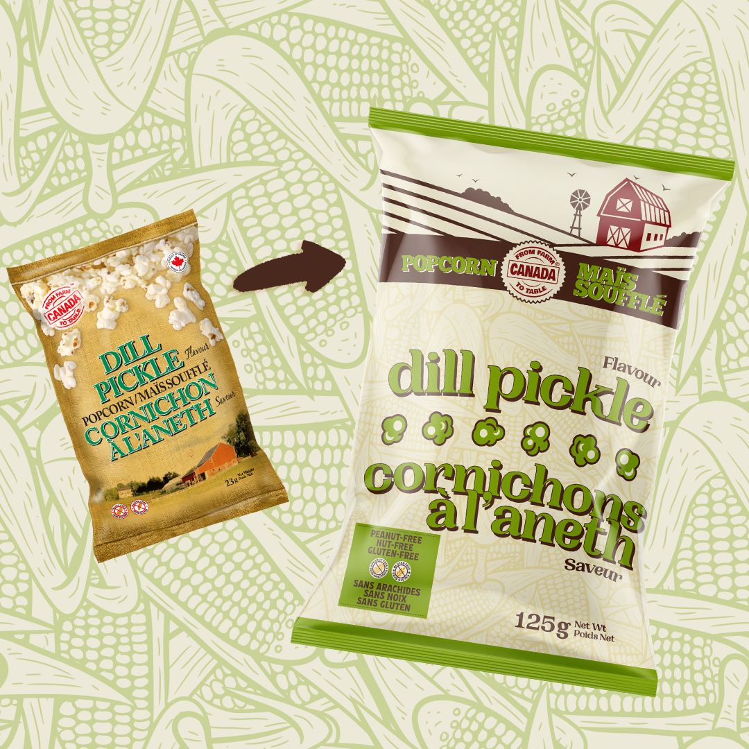
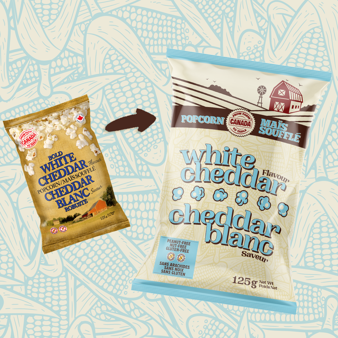
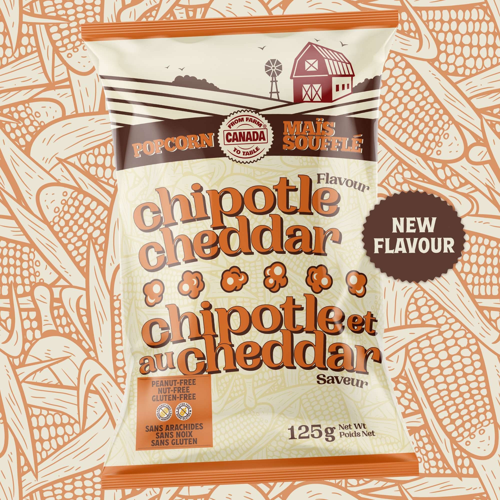
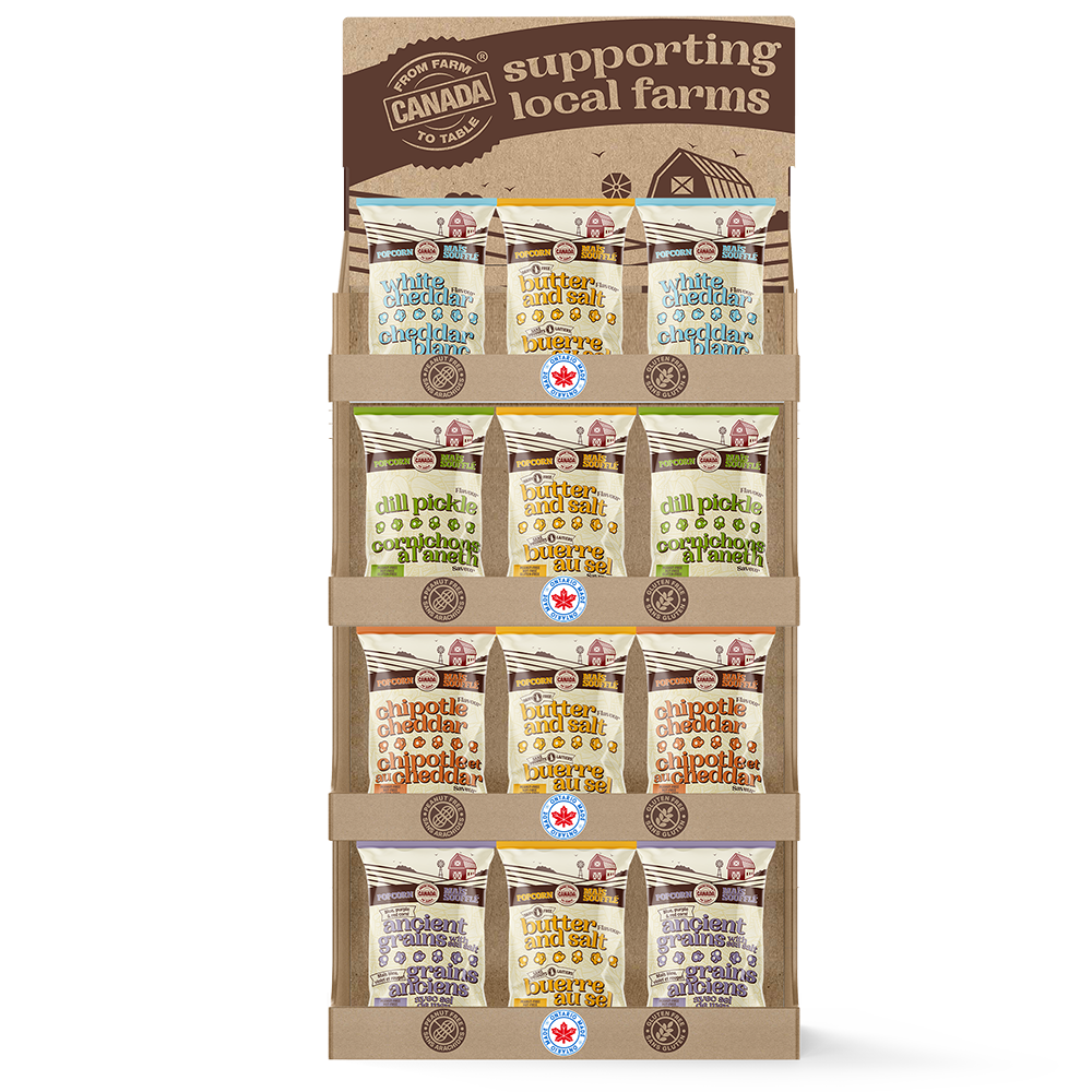
The project was extended to include retail-ready displays, and smaller format packaging including new flavours.
CLIENT: FROM FARM TO TABLE CANADA

More Detail:
The owner of From Farm to Table Canada recognized that her product's unique value proposition was not clearly conveyed on her packaging. She also realized that the number of colors used on the packaging was becoming a costly expense. That's when Eye Candy Design stepped in to revamp the branding and packaging design, bringing clarity and cost efficiency to the forefront.
The first step was to streamline the color palette. By simplifying the colors used on the packaging, we not only reduced printing costs but also created a more cohesive and visually appealing design. We wanted the colors to complement the product and evoke a sense of natural freshness.
To bring the essence of the farm experience to life, we transformed the farm photo into an illustration. This allowed us to highlight the charm and authenticity of the Ontario farm while ensuring it became a focal point of the packaging. The illustration immediately catches the eye and communicates the company's commitment to local sourcing and quality.
Choosing the right typefaces was crucial in creating an authentic Ontario farm feel. We selected typefaces that exuded warmth and a down-to-earth vibe. The typography played a significant role in conveying the brand's values and connecting with consumers on an emotional level.
With the redesigned packaging, even from a distance, you can instantly get a sense of the company and its mission to support local farmers and promote sustainable food practices. The packaging now tells a story that resonates with consumers, making it easier for them to connect with the brand and understand its unique value proposition.
The project didn't stop at packaging design alone. We extended our efforts to include retail-ready displays, ensuring that the brand's presence stood out on store shelves. These displays were strategically designed to catch attention and create a cohesive visual experience. Additionally, we worked on smaller format packaging for new flavors, maintaining consistency while adding variety to the product line.
The collaboration between From Farm to Table Canada and Eye Candy Design resulted in a brand transformation that not only addressed the clarity of the product's value proposition but also improved cost efficiency. The revamped packaging, with its streamlined colors, captivating farm illustration, and carefully chosen typefaces, embodies the company's commitment to local sourcing and Ontario farm traditions.
The redesigned packaging, retail displays, and expanded product line all contribute to a strong and cohesive brand identity.
This case study showcases the power of branding and packaging design in conveying a company's mission, connecting with consumers, and enhancing market presence. With Eye Candy Design's expertise, From Farm to Table Canada was able to create packaging that truly reflects their values and resonates with their target audience.