
Carmela’s Teff Crackers
Creating an innovative food product rooted in sustainability is not without its challenges.
Fortunately, by having a very clear design brief and knowledge of the market, we were able to create a strong brand that will sit among some pretty big names.
This project had a very large scope, and needed to fill many parameters. We developed branding to both in both official languages; retail packaging; a retail-ready box, and a bilingual website. Coordination with photographers and translators were required to ensure the project was a success. The result is a very cohesive, strong brand that will stand the test of time.
CLIENT: CARMELA’S KITCHEN
In today's world, creating an innovative food product rooted in sustainability is not without its challenges. However, with a clear design brief and knowledge of the market, branding agency Eye Candy Design was able to create a strong brand that will sit among some pretty big names. This case study will examine how Eye Candy Design tackled the challenge of developing branding, retail packaging, a retail-ready box, and a bilingual website for a sustainable food product.
Problem
The client approached Eye Candy Design with the challenge of creating a strong brand for a new food product that was focused on sustainability. The project had a very large scope, and required branding to be developed in both official languages, retail packaging, a retail-ready box, and a bilingual website. The client was looking for a cohesive, strong brand that would stand the test of time and represent the values of the company.
Solution
We took on the challenge by first understanding the client's needs and researching the market. They then developed a clear design brief that outlined the key objectives and target audience of the brand. With this in mind, they were able to create a strong brand that would sit among some of the big names in the market.
We focused on several key elements:
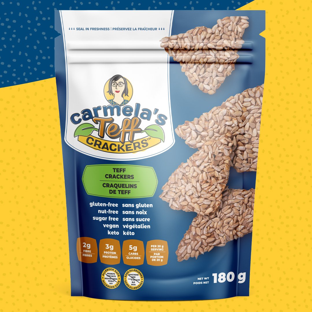
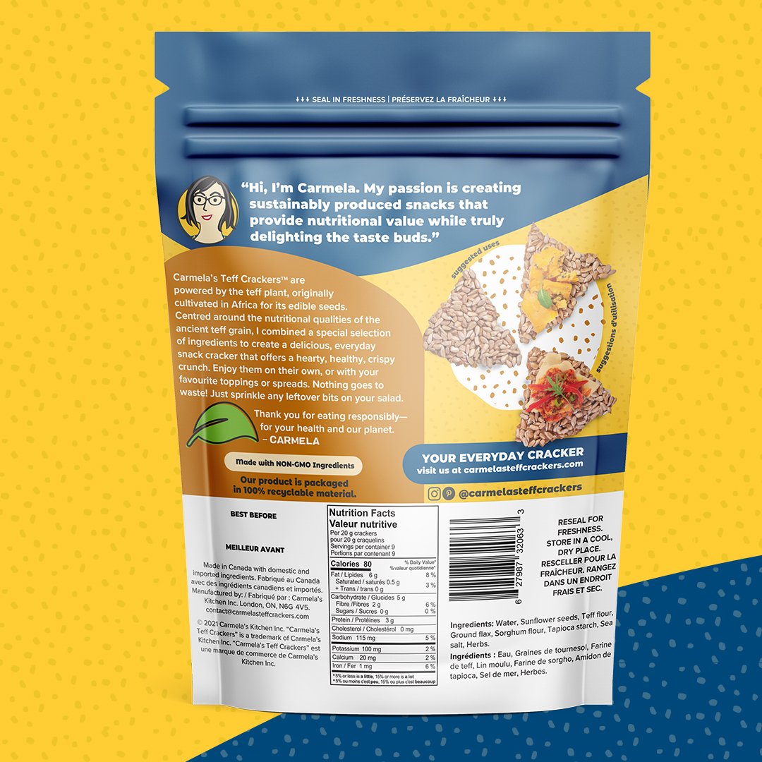
Sustainability: As the product was focused on sustainability, we made sure that the branding reflected this value. They used eco-friendly materials for the packaging and made sure that the website and marketing materials highlighted the sustainability aspect of the product.
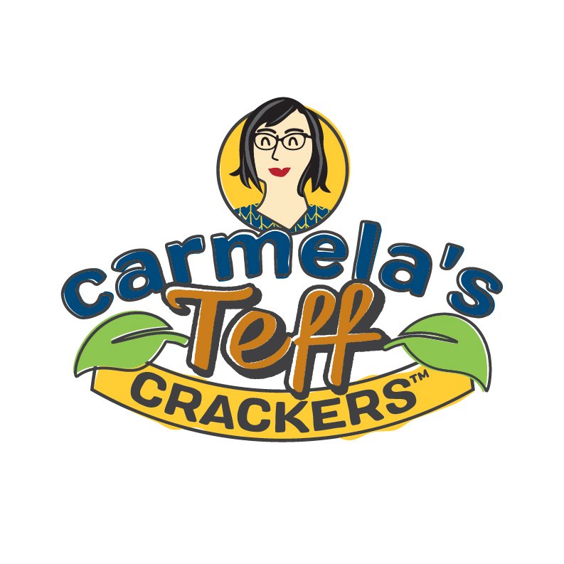
Bilingual Design: Branding was developed in both official languages, making sure that the product was accessible to all customers. They also made sure that the bilingual design was cohesive and strong, and that it represented the values of the company.
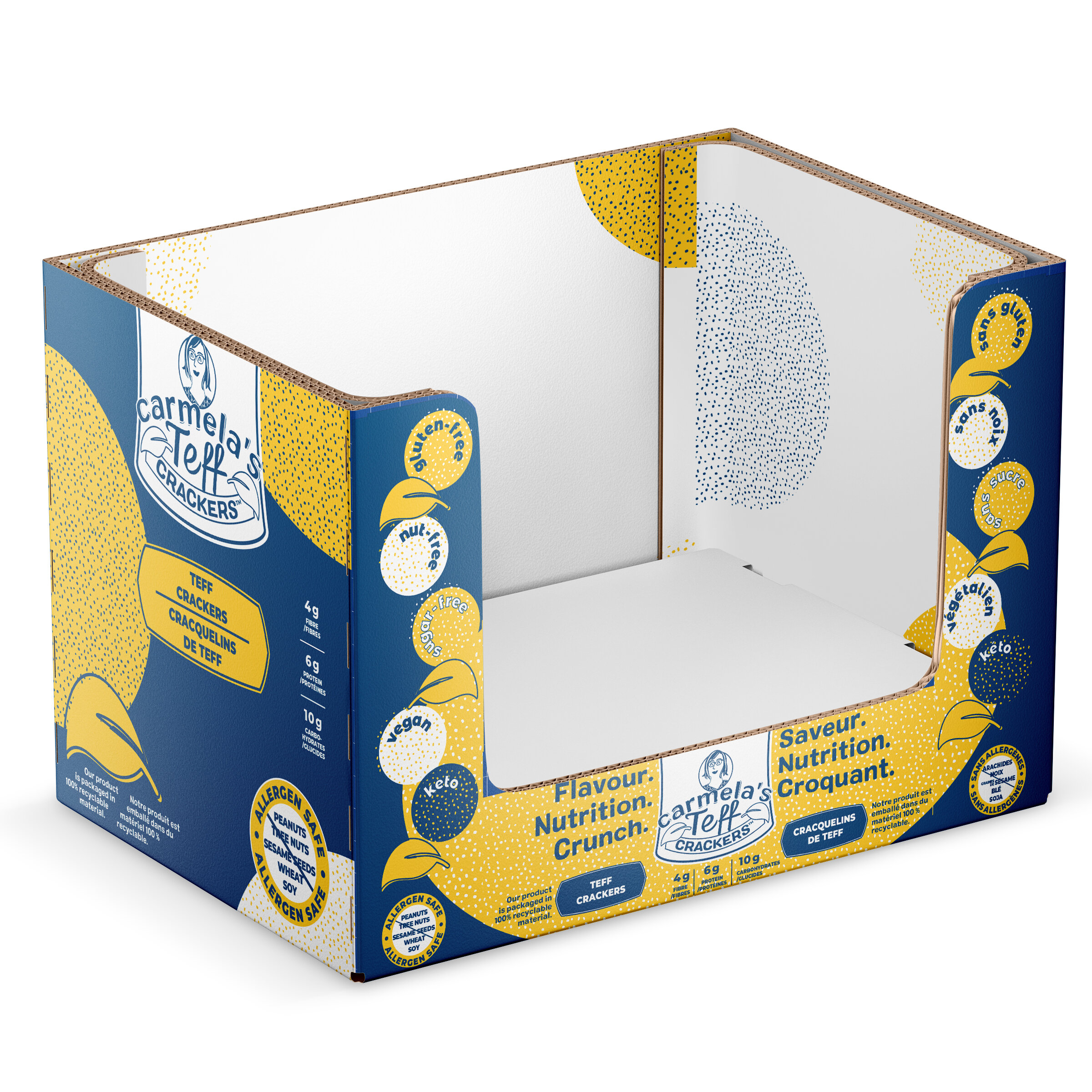
Retail Packaging: we developed retail packaging that was both functional and visually appealing. They made sure that the packaging reflected the brand's values and was easy to recognize on the shelves.
Retail-Ready Box: We also created a retail-ready box that was both functional and visually appealing. The box was designed to hold the product securely and also included branding elements that reinforced the company's values.
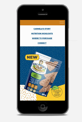
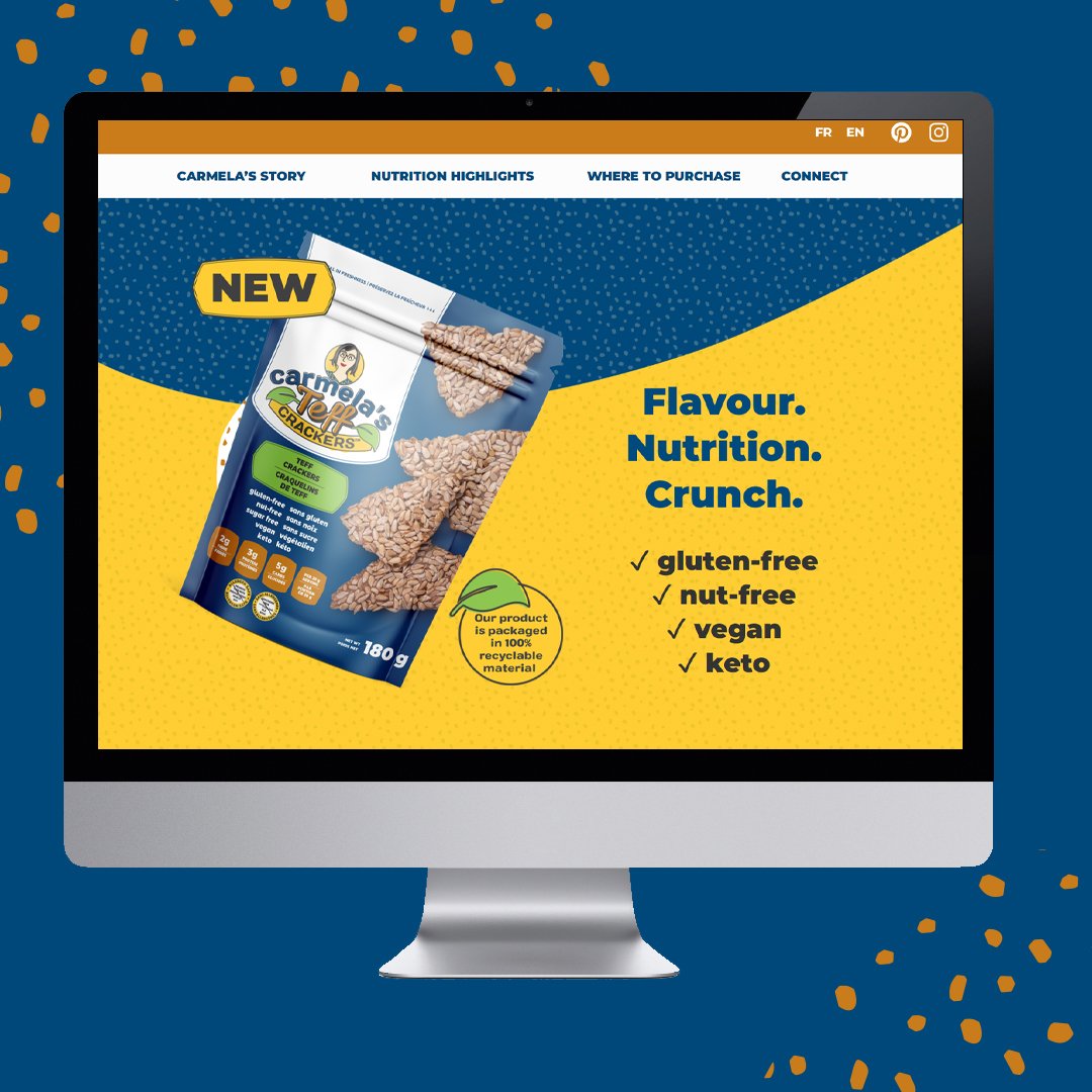
Bilingual Website: We created a bilingual landing page website that was easy to navigate and reflected the brand's values. The website included all the necessary information about the product, and also included a blog that highlighted the sustainability aspect of the product.
Result
The result of Eye Candy Design's efforts was a cohesive, strong brand that stood out among the big names in the market. The packaging and retail-ready box were functional and visually appealing, and the bilingual design made the product accessible to all customers. The bilingual website was easy to navigate and provided all the necessary information about the product, as well as highlighting the sustainability aspect of the brand.
The success of the branding was reflected in the sales of the product. The client was able to expand their reach and increase sales, and the strong branding helped to establish the brand as a leader in the sustainable food market.